

If you haven't heard, Less Annoying CRM is getting a redesign. We know change can be disruptive, so we're being careful to only make changes that solve real problems for our users. As part of this commitment, we're going to explain the reasoning behind all of the key updates so that you can understand what exactly is changing, and why.
Every time we add a new feature to LACRM, we keep simplicity as the primary focus. There are literally hundreds CRMs out there that have every feature imaginable, and we're not trying to be another one of those. If we build a feature, we want it to be as streamlined and intuitive as possible.
However, simplicity isn't a straightforward concept. One of the challenges we've faced is that simplicity might be defined differently depending on scope. When designing a new feature, there's the local scope (i.e. what is the best design for this specific feature?) and the global scope (i.e. what will work best in combination with all the other features?). Maybe on one form it makes sense for the "save" button to be at the top, and on another form it should be on the bottom. In that case, is it better to optimize each feature independently, or is it better to keep them consistent with each other even though that means one of the forms will be sub-optimal?
We're constantly balancing those two competing goals, but over time, we've probably moved too far in the "local optimization" direction and lost consistency. With this redesign, we want to reset things a bit and add a bit more consistency.
One way we're doing that is with a new element we're calling the Page Menu. We already talked about how the navigation will run along the left side of the page. In addition to that, each page will have a menu which will be right next to the navigation menu:
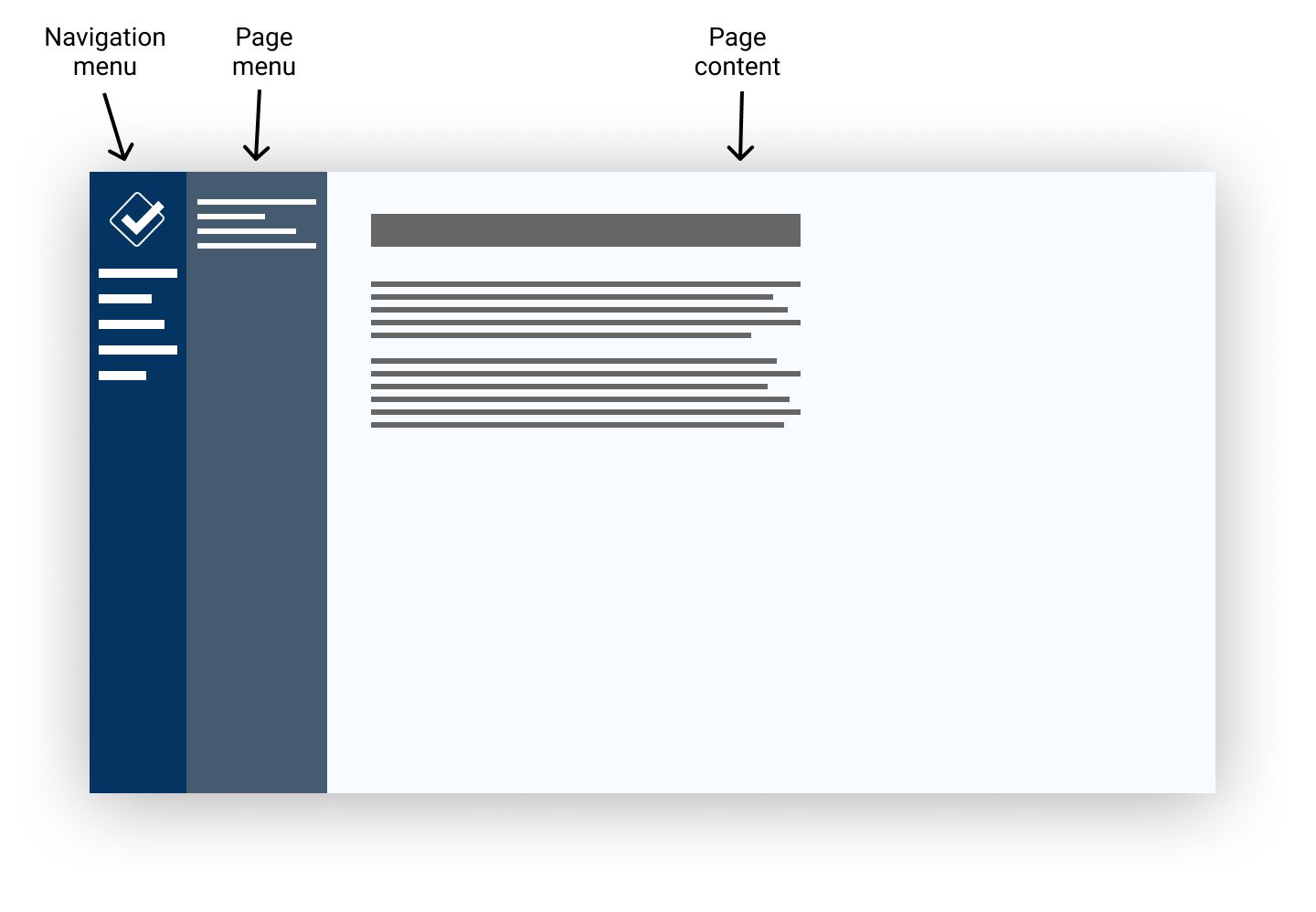
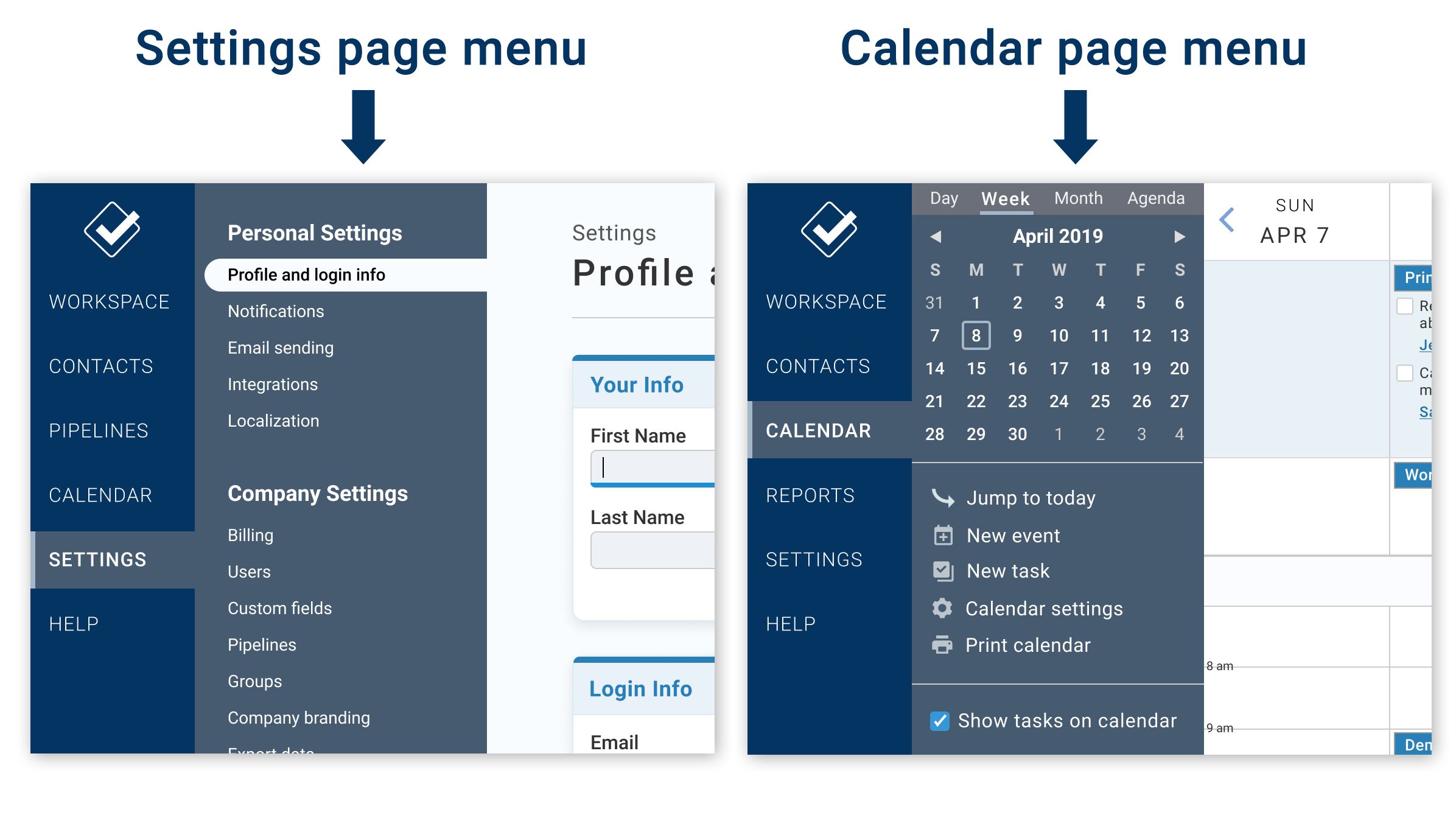
Whereas the navigation will be the same across the entire app, the page menu will be different on every page. It will contain any options that we think you might be interested in on that page. We've already shown you what the settings section page menu will look like. That's one example of how the page menu will be used. You're also probably already familiar with how the calendar sidebar works in the old design. That's another example of a page menu.
So every page will have a page menu containing controls you might need to interact with that specific page. Let's look at a couple more examples of what page menus will be used for:
Filters
Right now, if you view a report or list in the CRM (e.g. the Find a Contact page, pipeline reports, the task report, etc.) there is a bar running across the top of the page which allows you to filter, sort, export, and print. We've found that there are a couple issues with this approach. For starters, most of the time you're using those pages, you don't actually need to use any of that stuff, and so the first thing you see at the top is just needlessly complicating your experience. Because of that, we try to tone it down and make the filters as small and unobtrusive as possible, which leads to a different problem: when you do need to interact with those features, they can be hard to read. This especially impacts people with vision impairment because the text size is so small, and the contrast is low.
So basically, the filter bar is either too noticeable, or not noticeable enough. The page menu is the perfect opportunity for us to fix this:
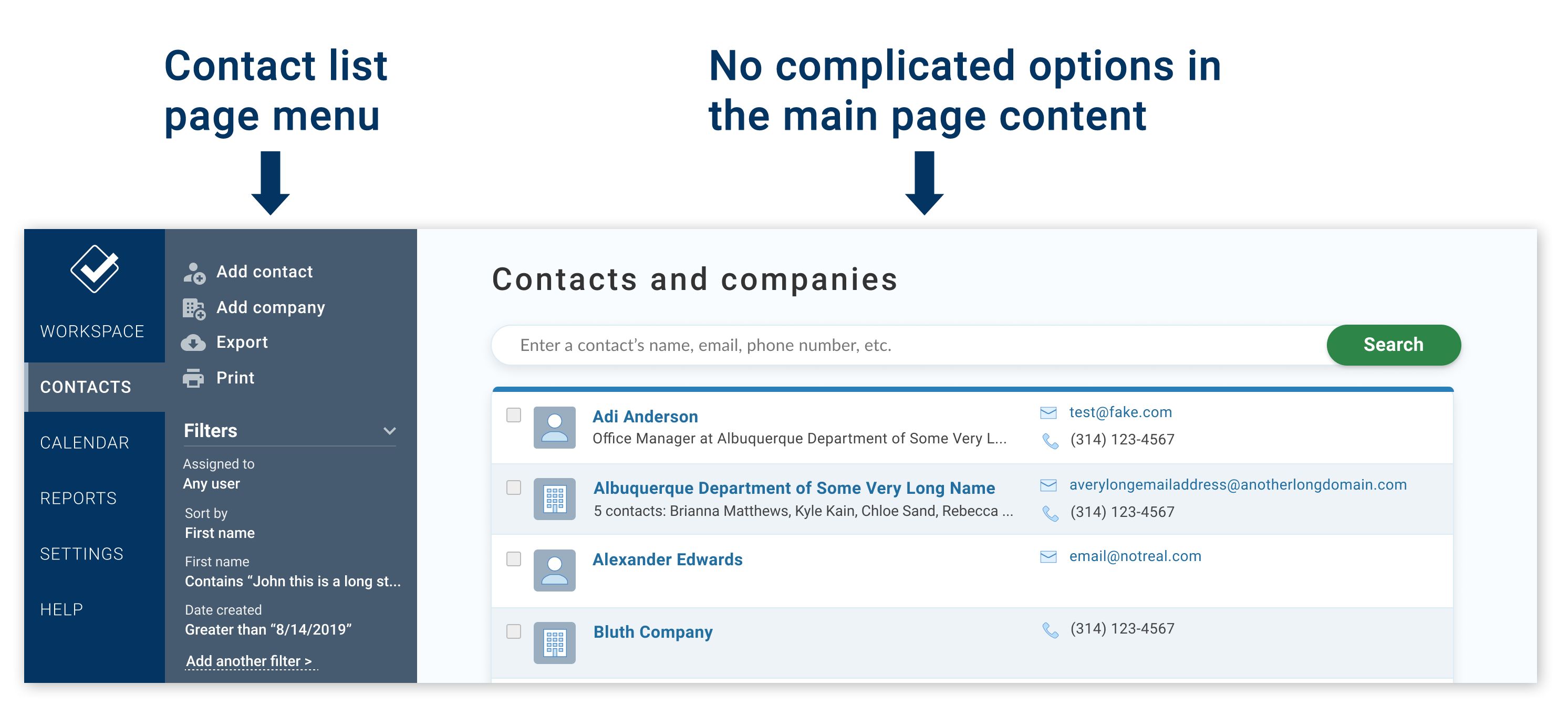
As you can see all of the non-primary options for interacting with the page are now in the page menu. So when you look at your contact list, there's less visual distraction getting in your way. But if you ever do need to access those additional options, they're just as accessible as ever. And because the page menu is designed to house additional options, they're actually easier to interact with. The text is bigger, the contrast is higher, and you don't need to look all over the page to find them (it's easier to scan a 1-dimensional list than a 2-dimensional grid).
Actions
Another issue with our old design is that each page had a completely different way of laying out the options. As mentioned above, the filters ran horizontally across the tops of report pages. Settings pages sometimes had sidebars on the left and sometimes on the right. The contact profile had options running along the left side of the page, but they were split into two sections.
One of our goals with the new page menu design is for you to always know where to go to see what your options are. The best example of this is the actions section on the contact profile page.
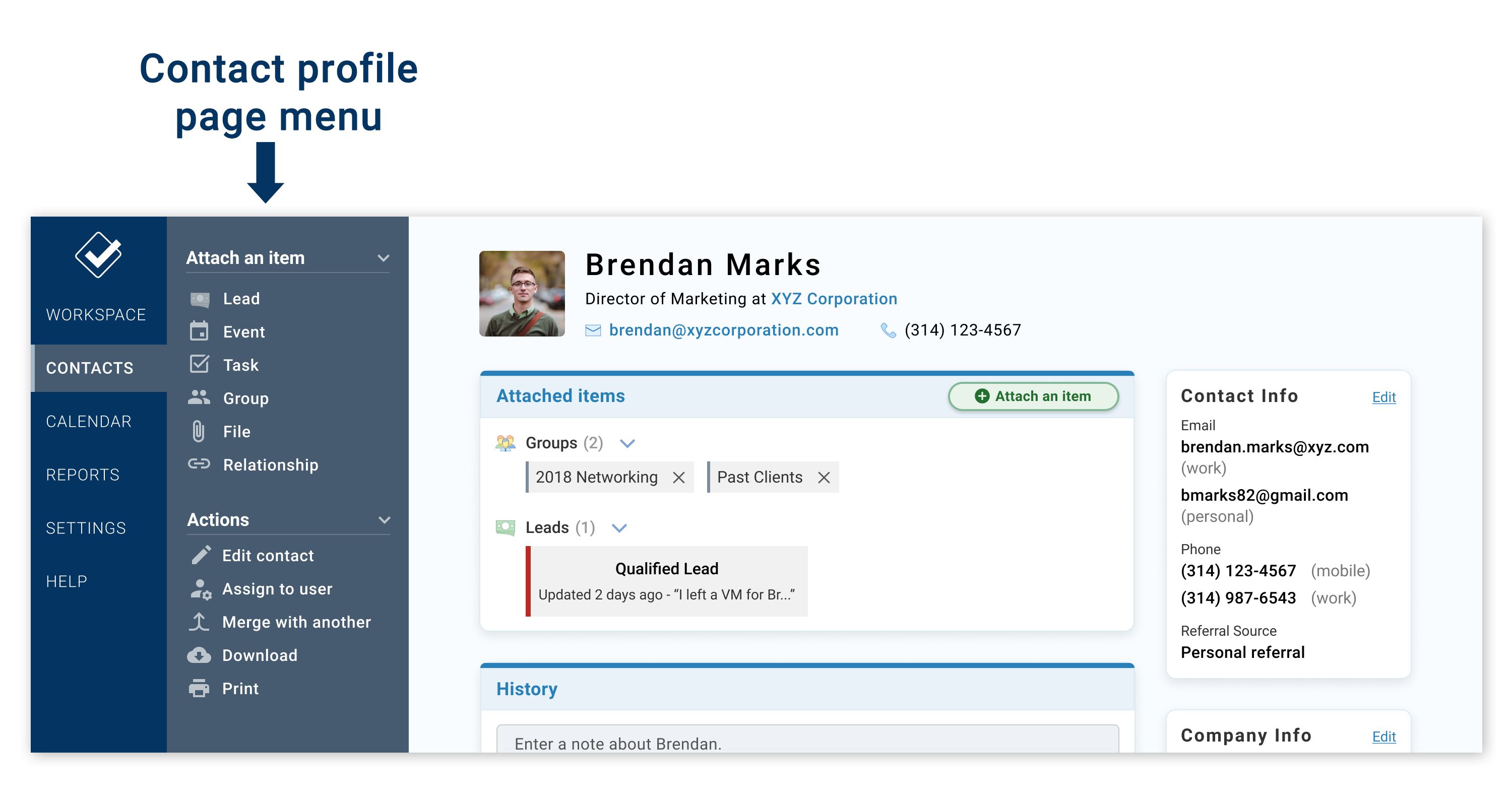
If you have a contact with a lot of info (contact details, attached items, activity, etc.) the page can get pretty busy. To some extent this is unavoidable, but we think the new design does a much better job of putting everything in a place where you can find it. If you need to take some action on this contact, just look at the page menu. All the links are right there. And that leaves the main page content more open to be laid out sensibly. In the early testing we've done with customers, we've found that people were able to find things such as contact info, attached items, and history much more easily with this new design.
Ok, I've probably rambled about page menus for long enough (sorry, we've been working on this for months, so I have a lot to say on the topic). To summarize: every page in the CRM will have a page menu which will contain helpful links, actions, and settings so that you can always see what your options are without having to scan through the entire page. This also keeps the main page content free from all that clutter so that you don't need to be distracted by the options unless you specifically want to look at the page menu.
As always, if you have any feedback for us, please don't hesitate to reach out!
Sign up to receive updates in your inbox