
This is the first of several updates about the upcoming redesign. We know change can be disruptive, so we're being careful to only make changes that solve real problems for our users. As part of this commitment, we're going to explain the reasoning behind all of the key updates so that you can understand what exactly is changing, and why.
At LACRM, we focus on simplicity. Our goal is to be the most intuitive CRM on the market, and for the most part we think we've accomplished that goal. But if there's one aspect of LACRM that doesn't live up to that standard, it's the settings section. As we've added functionality over the years, the settings section has become a graveyard for random options that didn't fit anywhere else. There's never really been much rhyme or reason to it, and customers we've talked to about this agree that the layout of the settings section is confusing.
We need to fix that in the new design. We don't really have that many settings options, so there's no reason why new and old users alike shouldn't be able to find what they're looking for. In this post, I'm going to explain what was wrong with the old layout, and how the new layout will work. There are a few different issues that we wanted to address:
Note 1: Even though the layout is changing, it's important to understand that we aren't fundamentally changing anything about how the CRM works. Everything you could do in the old version you'll be able to do in the new one.
Grids are terrible for finding things
Our old settings page laid the pages out as a grid. This seemed like a good choice at the time because it let us fit everything on one page and have plenty of detail about each option. The problem is that it's actually pretty hard to scan 2-dimensional lists of things. It's too easy to accidentally gloss over an option and miss what you're looking for.

We've done countless demos with customers where we'll say something like "click on the 'Personal preferences' option" and they'd spend way too long trying to find it in that list. Lesson learned. Grids are no good for this type of thing, and we need to switch to 1-dimensional list to make it easier to scan. Here's what the new layout looks like:

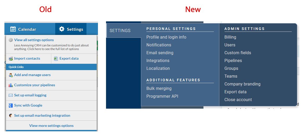
Notice that the list of settings options runs along the left side of the page. In our testing, we've found that this makes it easier for customers to scan the list and find what they're looking for. It also has the added benefit that because this approach takes up less space, we'll be able to show this settings sidebar on every single settings page. This makes it really easy to explore all your options because you don't have to go back to the main settings page to click around through the various settings sections.
The hierarchy didn't make any sense
As the person who designed the original settings layout, I think this is the most embarrassing issue for me. If you look at the current design shown above, the way things are sectioned off just makes no sense. "Setting up your CRM" should not be a section. And even if it is a section, why is exporting there? And why is "Billing information" under the "Personal Settings" section?
I could make some kind of excuse about how this section grew over time and we didn't really plan it this way, but honestly, I think it's just bad design. It needs to be fixed.
If you look at the new design, you'll see three (hopefully) clear sections:
- "Personal settings" is where the things that apply just to your personal user will be found.
- "Admin settings" is where your account-wide settings will be found. If you're on a one-user account, there's not much difference here, but if you add users, these settings will be the ones that impact everyone on your account (e.g. you can make pipelines which everyone will see). Anyone without admin permissions won't see that section at all, so their settings will be much simpler.
- "Additional features" is exactly what it sounds like. These are features that most people don't use often, but sometimes they come in handy.
You still may need to look around a bit to find exactly what you're looking for, but we've tested this new layout out with users and people seem to find things much faster.
There were too many settings thrown into random places
As the number of settings options has grown, the settings section ended up being a collection of random preferences on whatever page seemed most appropriate. We wanted to take this redesign as an opportunity to clean this up and make a more consistent experience.
One example of this is that you'll notice there's no "Calendar settings" page in the new design. That's because you'll be able to control those directly from the calendar. Why force someone to dig through settings to edit the behavior of a specific page?
Another example is the old "Personal preferences" page. Without looking at that page, would you have any idea what to find there? It was basically a graveyard of whatever random settings didn't fit anywhere else. In the new design, we've made more logical groups of settings which eliminated the need for personal preferences. The notifications have moved to a dedicated "notifications" section. Enabling click-to-call has moved to the integrations, etc.
There's now a single "Integrations" page which will guide you through all the integrations options we have instead of the old approach which kept each integration as a completely separate page. This will also make it easier for us to highlight new integrations as they become available (teaser: have I mentioned that Outlook Calendar sync will be released at the same time as this redesign?)
The navigation only exposed a few of the settings pages
I'm going to write an entire blog post about how our navigation is changing, so for now I'll just mention how the settings part of the navigation menu has changed. In the old design, when you moused over "settings" a dropdown would show linking to specific settings pages, which caused some people to not realize there were more options available. As you can see below, the new mouse-over shows every single settings page so that list is consistent with the main settings list shown above.
Ok, I think that covers all the meaningful changes coming to the settings section. Once again, I want to emphasize that this change is all about making the settings easier to find, not about removing or even changing functionality. It's still the same LACRM you already know and love, just with a fresh coat of paint based on countless conversations with customers.
If you have any questions or feedback, please don't hesitate to reach out!
Sign up to receive updates in your inbox